>>Identity
Art Haven
Rebranding for a Non-profit Community Art Center
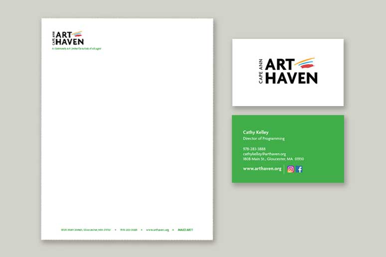
Art Haven provides quality art education to almost 1000 children, teens and adults on Cape Ann, including a robust scholarship program and free events for the community. After 10 years the organization had never been branded and needed a new visual identity to act as an umbrella to the two aspects of the program–the children’s programs on one hand and the teen and adult programs on the other. CKD updated the logo to look less child-focused and more inclusive of all students, creating a branded visual identity that could be implemented across all print and digital materials. The new brand is approachable and conveys the positive energy of the studio and the quality of the curriculum. CKD developed marketing materials including a 3-panel flyer, business cards and letterhead, print materials for the Annual Fundraising Campaign, print advertising for all classes and a recognizable look for the center’s social media presence. Templates and style sheets were provided for staff who will be designing new materials going forward. CKD updated the website to reflect the new branding, added functionality to improve usability, and wrote new content including a weekly blog for marketing and SEO purposes.
letterhead-and-flyer
Letterhead and Business Card
3Panel-New
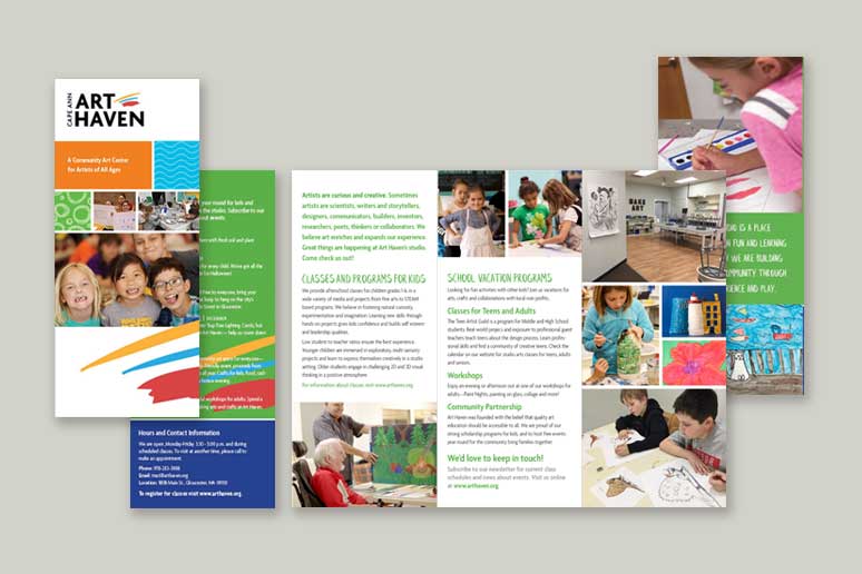
Trifold Brochure

Art-Haven-Kids-2
Client: Art Haven Project: Re-brand marketing materials for children’s programs at a non-profit community art center.
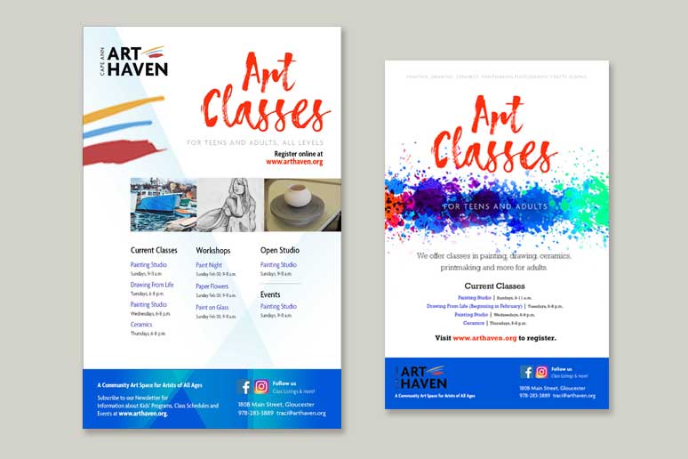
Art-Haven_adult-flyers
Posters for Teen and Adult Classes
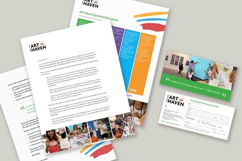
Art-Haven-annual-appeal
Print Collateral / Annual Fundraising Campaign
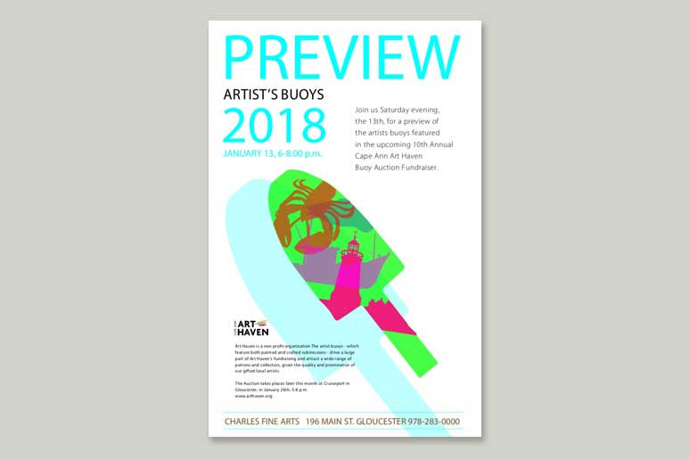
Art-Haven-Exhibit-Poster-OP
Poster for Artist’s Buoys Exhibit
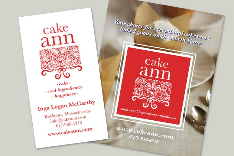
Cake Ann
Logo, Business Card and Photography for Website
New logo designed for use on the bakery’s website and in sales collateral. Cake Ann is a boutique bakery in a small community that offers a unique and exceptional product at their store location, wholesale and at local farmer’s markets.
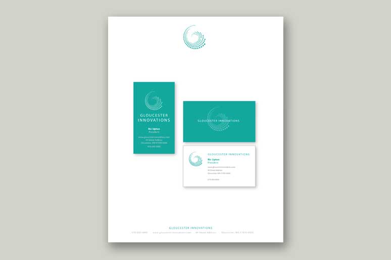
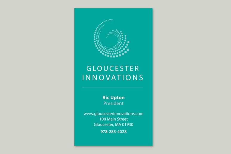
Gloucester Innovation
Logo and Concept for Business Cards and Letterhead
Logo and concepts created as part of a corporate identity program and website project. The company is a forward-thinking leader in bringing together business solutions and innovations in technology.
Sacred Temple Arts
Logo and Identity Program
The project was designed from the ground up to not only advertise but educate and build a market around a delicate topic whose focus is wholistic health. It included a logo and recognizable visual vocabulary including color palette, imagery, artwork, and typographic style guide used in the creation of both printed materials and on her website.

Media Program Network
Identity Program
MPN is a small company which develops cooking and lifestyle content to market to online newspapers nationally. The logo was designed to embrace the mission of a still-evolving business with intentions to grow in new directions within the media industry.
Paul F. Murphy
Campaign Logo and Sign
Logo and signage created and produced for a 2013 election.